Customize Element Web’s Theme and Branding
Set a branded name, custom colors, and login assets for your Element Web deployment while understanding which parts remain Element-branded.
For a self-hosted Element Web deployment, set the app name and default theme in its config.json, then use the documented branding options for the login logo, background, logo link, and footer links. For custom colors, define a theme under setting_defaults.custom_themes and point default_theme to its custom- name. These settings personalize Element, but they do not turn it into a complete white-label product.
Element’s configuration separates product identity, color themes, and page assets. Choose the smallest change that solves your goal:
| Goal | Configuration | What it changes |
|---|---|---|
| Show your service name | brand | App name in various strings and locations |
| Set a light, dark, or custom starting theme | default_theme | Default color theme for the deployment |
| Change login and welcome appearance | branding | Auth page logo, background, logo link, and footer links |
| Set custom colors and fonts | setting_defaults.custom_themes | Theme options such as color tokens and font families |
Verified: Element’s documentation says it supports some customization but not complete rebranding or private labeling. Practical implication: changing brand will not replace every logo, icon, image, or product reference. If you need every visual and string changed, expect to maintain a customized build and recheck it after upgrades. Start by listing the exact UI elements your users need to see before choosing a config-only approach.
Element Web reads config.json at startup. Back up the current file and edit it in place so you keep required settings such as the default homeserver. For a release tarball, the file is in the deployed web directory; the Debian package uses /etc/element-web/config.json. With Docker, mount your config at /app/config.json. The correct location depends on how you installed Element, so verify your deployment method before editing.
Add the following keys to the existing JSON object, combining them with any settings already present. Do not paste this as a replacement for the entire configuration:
{
  "brand": "Northstar Chat",
  "default_theme": "dark",
  "permalink_prefix": "https://chat.example.org",
  "branding": {
    "logo_link_url": "https://example.org",
    "auth_header_logo_url": "https://chat.example.org/assets/logo.svg",
    "welcome_background_url": "https://chat.example.org/assets/welcome.jpg",
    "auth_footer_links": [
      { "text": "Help", "url": "https://example.org/help" },
      { "text": "Privacy", "url": "https://example.org/privacy" }
    ]
  }
}
Replace the example name, hostnames, and assets with your own. brand changes the app name in various places; permalink_prefix makes shared permalinks point to your Element deployment rather than matrix.to. The logo and background entries are URLs loaded by the browser. Serve them over HTTPS from a location your users can reach, and confirm that access controls, content security policy, and caching do not block them. The docs do not specify one universal image size for the auth logo, so preview your actual asset rather than assuming a fixed dimension.
Depends on deployment: a config file affects the Element Web instance that serves it. It does not change the official app.element.io service or automatically change Element’s separate mobile or desktop apps. Make the edit on the host or container serving your own instance.
For a simple color and font theme, Element documents custom theme definitions inside setting_defaults.custom_themes. The theme’s internal name is prefixed with custom-; use that full name in default_theme. This example shows a compact custom theme. It is a starting point, not a complete palette:
{
  "default_theme": "custom-Northstar",
  "setting_defaults": {
    "custom_themes": [
      {
        "name": "Northstar",
        "is_dark": false,
        "fonts": {
          "general": "Inter, sans-serif",
          "monospace": "'Courier New'"
        },
        "colors": {
          "accent-color": "#3157A4",
          "primary-color": "#3157A4",
          "warning-color": "#B5473C",
          "sidebar-color": "#202A3B",
          "roomlist-background-color": "#F3F5F8",
          "roomlist-text-color": "#202938",
          "timeline-background-color": "#FFFFFF",
          "timeline-text-color": "#202938"
        }
      }
    ]
  }
}
Merge these keys into your existing JSON rather than creating a second setting_defaults object. Keep the contrast between text, backgrounds, and controls readable in both normal and highlighted states. Element’s theme reference includes additional optional colors, username and avatar color arrays, custom font faces, and Compound design tokens. Add only values you have reviewed in the current reference; an incomplete palette can leave some parts of the interface using defaults.
Common misunderstanding: setting default_theme chooses the deployment’s default; the documentation does not describe it as a policy that locks every user’s appearance setting. If you need a strict enforced theme, verify that behavior against the exact Element Web release you run instead of assuming the default is a lock.
For a runtime theme test, Element’s theming notes describe loading a JSON theme URL from /devtools under “Custom themes.” Treat that as a testing or user-side workflow, not a substitute for deploying the intended config to all clients. For a maintainable deployment, keep the config and assets under version control and repeat this check when upgrading Element Web.
The behavior described here follows the official Element Web configuration and theming documentation checked October 10, 2026. Review the references for your installed release before relying on a setting: Element Web configuration reference, Element Web theming documentation, and Element Web installation documentation.
Set a branded name, custom colors, and login assets for your Element Web deployment while understanding which parts remain Element-branded.
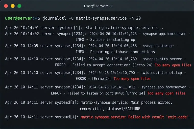
Diagnose whether Synapse hit its per-process open-file cap, set a systemd drop-in for the right service or worker, and verify the live limit.
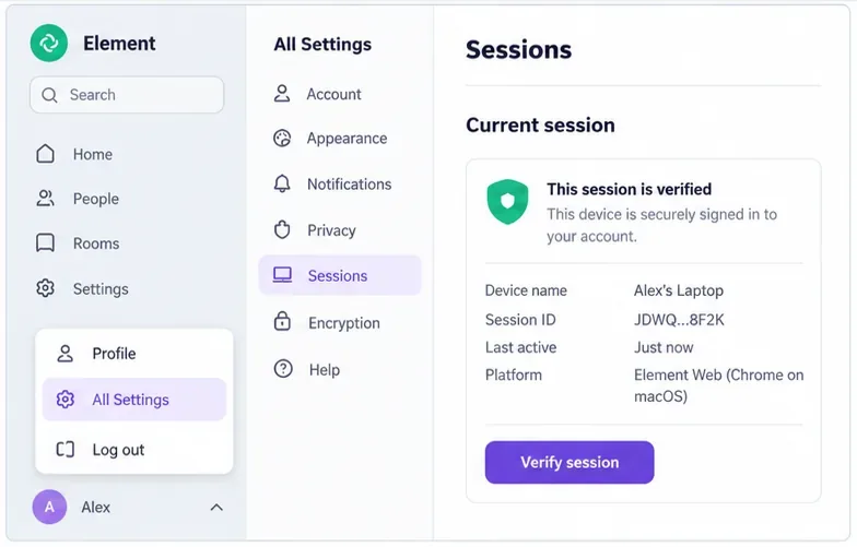
Find out whether the error is limited to one browser or one event, then use Element’s recovery key or a trusted device without risking your remaining encrypted history.
Use Synapse’s history and media purge APIs or retention settings to remove stale data safely, then verify completion and disk-space recovery.
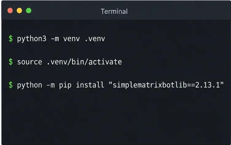
Install the current library, connect a dedicated Matrix account, and run a small !echo bot with safer credential handling and a clear test.
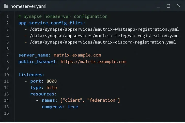
Set up three mautrix bridges with separate registrations, logins, and tests—and avoid Docker networking, account-policy, and sync surprises.
Find what is filling Synapse storage, set safe media retention, and purge remote cache without deleting files directly from disk.
Review device activity, deactivate confirmed inactive Synapse accounts through the Admin API, and learn what the optional erase flag actually removes.
Find whether PostgreSQL memory comes from query work, shared buffers, connections, or maintenance, then make targeted Synapse-safe changes.
Trace slow Matrix room joins to one remote homeserver, federation backoff, local database load, or an outbound sender queue before changing Synapse settings.